ClickUp is an incredibly flexible project management platform, but with that flexibility comes complexity especially when it comes to tracking progress. One of the most misunderstood aspects of ClickUp, especially among teams with multiple departments or stakeholder layers, is the difference between Manual Progress and Planned Progress.
While ClickUp gives users the ability to report on both types, it does not offer a native way to compare them intelligently or flag inconsistencies between the two. This results in confusion, inaccurate dashboards, misaligned team expectations, and ultimately poor decision-making.
In this article, we’ll explore what each type of progress means, why confusion is so common, and the detailed technical and strategic solutions we’ve implemented across multiple organizations including a fully working solution delivered for a global automotive group to bring alignment and accountability back to progress reporting.
What’s the Difference Between Manual and Planned Progress?
Manual Progress
Manual progress typically refers to a custom percentage field or dropdown field where team members manually enter the status of a task or objective. This is usually based on their judgment or a subjective interpretation of how “done” the work is.
Example: A project owner might mark a task as “75% Complete” based on recent updates or personal evaluation, even if most of the subtasks are still open.
Planned Progress
Planned progress refers to calculated progress based on objective data such as:
- Time elapsed between the start and due dates of a task
- The percentage of completed subtasks
- The number of linked deliverables completed
- Any weighted formulas based on task complexity or duration
It is driven by structure and scheduling rather than user input.
Example: If a task is scheduled from May 1 to May 31 and today is May 16, the planned progress is automatically calculated as 50%, assuming work should progress evenly over time.
Why Are Teams Getting Confused?
Without formal training or a unified system, teams often assume that the progress they are seeing or entering represents reality. However, different people use different fields. This leads to inconsistent data, poor visibility, and contradictions across reports.
Here are common signs this confusion is happening:
- Reports show a project as nearly complete, but multiple deliverables are still open.
- One stakeholder updates a project to 90% manually, while the timeline and subtasks suggest it’s only halfway done.
- Executives ask for real-time status but receive dashboards that reflect subjective updates rather than true work completion.
- Teams rely on subtasks being checked off to signal progress, while others override that with manual input based on perceived status.
This leads to inaccurate decision-making, miscommunication, and in some cases, duplicate or unnecessary work.
Formula-Based Solution: Comparing Manual vs. Planned Progress
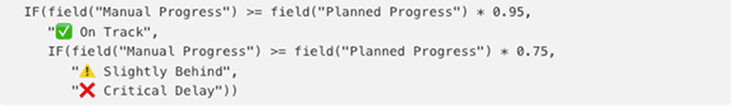
To solve this, we’ve implemented a custom formula field that compares both values and surfaces discrepancies. This allows stakeholders to immediately see whether the manual updates are in line with what is expected based on the plan.
Example Formula:
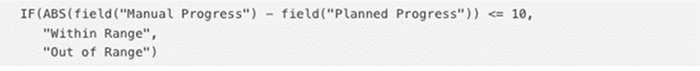
![]()
This formula checks if the manual progress is within 95% of the planned progress. If it is, the task is considered on track. If not, it flags the task for further review.
This comparison field can be:
- Displayed in list views
- Used in dashboards
- Filtered to show only “at-risk” tasks
- Integrated into weekly review workflows
Other Useful Formulas to Compare Manual Progress with Planned Progress in ClickUp
If you want alternatives for different tones or formats, here are a few more options:
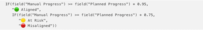
1. Multi-Range Status Indicator
Purpose: Adds three-level status indicator (On Track, Slightly Behind, Critical) for dashboards
2. Progress Variance in Percentage
Purpose: Calculates the numerical variance between manual and planned progress to show how far off they are.
ROUND(field(“Manual Progress”) – field(“Planned Progress”), 1)
Add this as a separate field labeled “Variance (%)” for analytical dashboards.
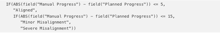
3. Tolerance Check with Custom Ranges
Purpose: Shows whether manual progress is within a custom acceptable range (+/- 10% of planned).
4. Alert Flag for Executive Review
Purpose: Triggers a flag if manual progress exceeds planned by too much (suggests possible inflation).

5. Formula for Visual Dashboard Tags
Purpose: Creates color-coded tags for dashboards based on how closely aligned the progress is.
6. Delayed but Overreported Flag
Purpose: Identifies cases where manual progress is greater than planned progress AND the task is overdue.

7. Progress Delta with Positive/Negative Sign
Purpose: Adds a +/- sign to make variance direction clear.

8. Textual Explanation Output
Purpose: Displays an explanatory message for reports or training dashboards.

9. Variance Band Classification
Purpose: Classifies how significant the misalignment is in plain terms for stakeholder reports.
These formulas have been deployed across different types of reporting dashboards OKRs, project portfolios, KPI scorecards, RAID logs, and milestone reviews and can be adjusted depending on the % thresholds, acceptable variances, and user roles involved.
Solution Implementations Across Different Clients
We have applied this solution in many ways across different industries and use cases. Below are examples of how we adapted the solution for various real-world needs, including a complex configuration for a large automotive group (without naming the client) that had to support multiple business units and leadership layers.
Use Case 1: Task-to-Objective Alignment
In environments where teams update progress manually but leaders need objective status tied to deliverables, we set up:
- Manual Progress as a dropdown field (0%, 25%, 50%, 75%, 100%)
- Planned Progress calculated based on task duration
- A formula that highlights tasks where manual progress significantly exceeds or lags behind planned progress
This solution helped ensure that manual status updates were supported by actual delivery timelines.
Use Case 2: Weekly Dashboard Review
For teams conducting weekly reviews, we configured dashboards to include:
- A field that compares manual and planned progress
- A visual indicator for misalignment (e.g., red, yellow, green)
- Filters for overdue or “behind” tasks
This dashboard became the central location for sprint reviews and status checks without relying on verbal updates or manual slide decks.
Use Case 3: Implementation for a Global Automotive Enterprise
This particular group required progress reporting across multiple business units, including HR, supply chain, and product delivery. Manual updates were being entered at various levels, while the PMO expected data-driven tracking for milestone achievement.
We delivered a hybrid solution with the following structure:
- Manual Progress field labeled clearly as “Reported Progress”
- Planned Progress field using a combination of time-based logic and subtask completion
- Formula that validated whether the reported progress matched scheduled expectations
- Dashboard showing three columns: Planned, Manual, and Variance Status
- Variance thresholds set to 5% tolerance (within range = green, over/under = flagged)
The PMO team used this configuration during review meetings with directors and aligned it with executive-level reporting metrics. This brought clarity across dozens of departments and helped standardize progress reporting without requiring changes to existing team workflows.
How We Train Teams to Understand the Difference
Technology alone does not solve the issue. To truly prevent confusion, we provide structured training and workspace design support, including:
- Custom field naming conventions such as:
- “Manual % (Entered by User)”
- “Planned % (Based on Schedule)”
- Formula field labels such as:
- “Variance Status”
- “Aligned or Not Aligned”
- In-field descriptions to explain what the field means and how it works
- Recorded Loom videos or live sessions showing teams how to interpret dashboards
- Validation processes during weekly planning or closeout calls
This reduces ambiguity and builds long-term reliability in how progress is tracked.
Limitations of ClickUp’s Native Functionality
ClickUp does not currently offer a built-in method to compare manual and planned progress or to alert users when values fall out of sync. There are no default settings or system alerts for misalignment, which means these issues can go unnoticed without custom configuration.
Until ClickUp offers native features for this, the solution remains:
- Custom fields
- Calculated formulas
- Consistent workspace standards
- Targeted training
Dtech Systems: Your Partner in Progress Tracking
As the only verified ClickUp Partner in Saudi Arabia, DTech Systems has worked with organizations across government, logistics, manufacturing, finance, and education to solve exactly this type of challenge.
We offer:
- Full ClickUp implementation
- Custom formula development for KPI and progress reporting
- Dashboard design for department-level and executive-level users
- Workspace training for end users and project managers
- Continuous support and scaling as your workspace grows
If your team struggles with inconsistent reporting or confusion between different progress indicators, we can deliver a structured, scalable solution.
Contact Dtech Systems for a free audit of your current ClickUp reporting setup.
Final Thoughts
The confusion between Manual and Planned Progress is more than a minor reporting detail. It can break trust in your dashboards, delay decision-making, and weaken your ability to manage performance at scale.
Using custom fields, targeted formulas, and structured training, Dtech Systems helps teams solve this problem and build reporting dashboards that reflect true project status. Whether your team is reporting to stakeholders, managing OKRs, or tracking departmental KPIs, progress must be measured correctly to be useful.
We’ve done it across industries, team sizes, and complexity levels. We can do it for you.
Let’s build clarity into your ClickUp environment, one formula at a time.