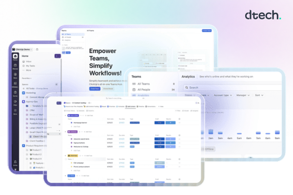
Quick answer: ClickUp reporting tools give teams a single, real-time view of task progress, time spent, workload, and goal status through Dashboards, Time Tracking reports, Sprint and Goal reports, and the AI assistant ClickUp Brain — replacing manual status updates and spreadsheets with live data your team can act on immediately.
What Are ClickUp Reporting Tools?
ClickUp reporting tools are the built-in features inside ClickUp — Dashboards, time reports, Goals, Sprint reports, and AI summaries — that turn raw task data into visuals your team can read at a glance. ClickUp dashboards provide powerful reporting and analytics capabilities, allowing teams to gain insights into their workspace like never before, with customizable widgets displaying metrics, graphs, and task lists that make tracking progress and identifying trends easy. Instead of someone pulling numbers manually from five different lists every Friday, these tools pull live data from every task, list, and Space and turn it into a screen your team can actually use.
The Core ClickUp Reporting Tools Every Team Should Use
Most teams only ever touch a fraction of what’s available. These are the tools worth setting up first.
Dashboards
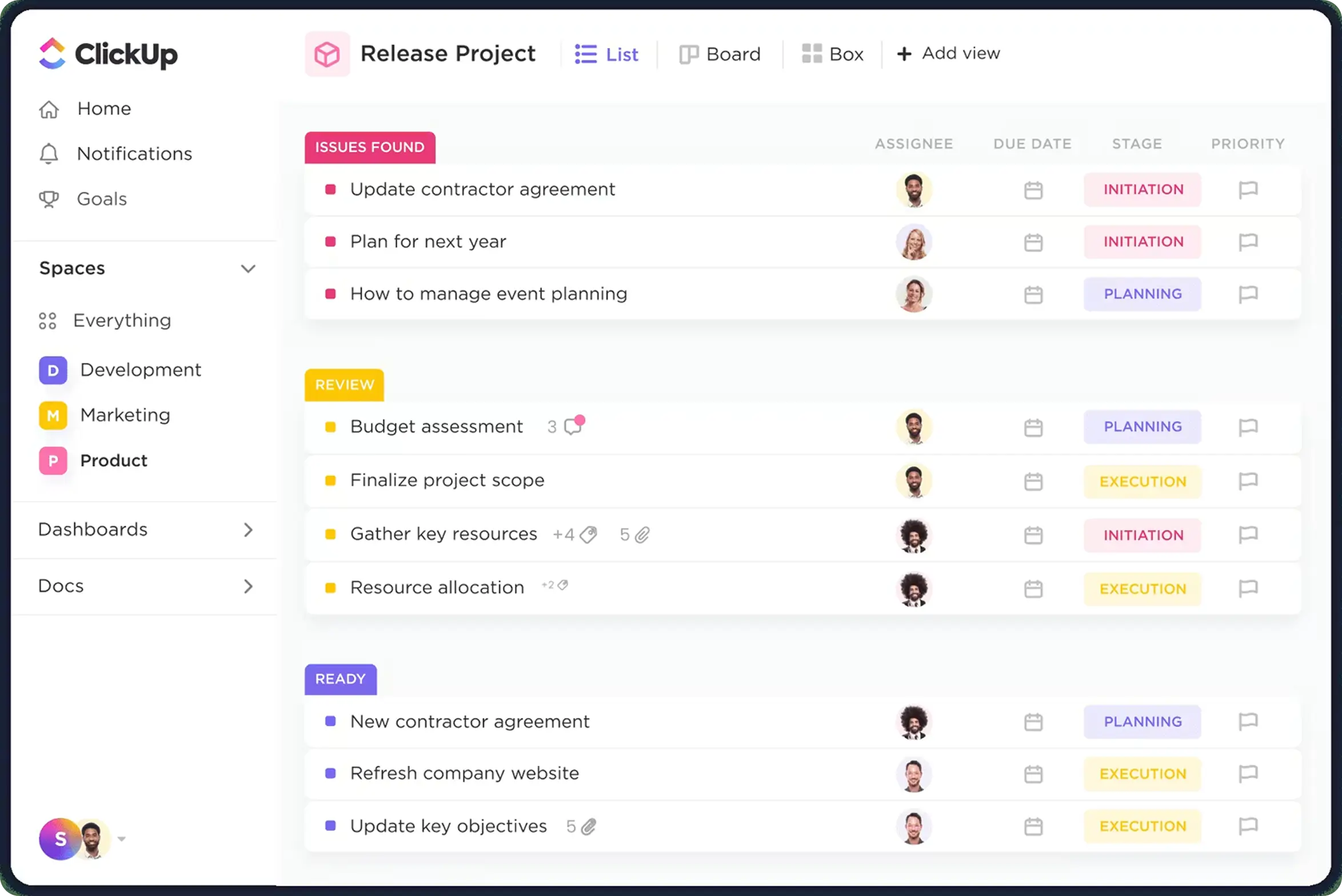
Dashboards are the centerpiece of ClickUp’s reporting suite. ClickUp dashboards offer custom reporting with more than 50 widget types — charts, lists, calculations, and embeds — so a team can build one screen that shows sprint burndown, overdue tasks, and workload side by side, instead of clicking through five separate lists to piece the same picture together.
Time Tracking and Timesheets
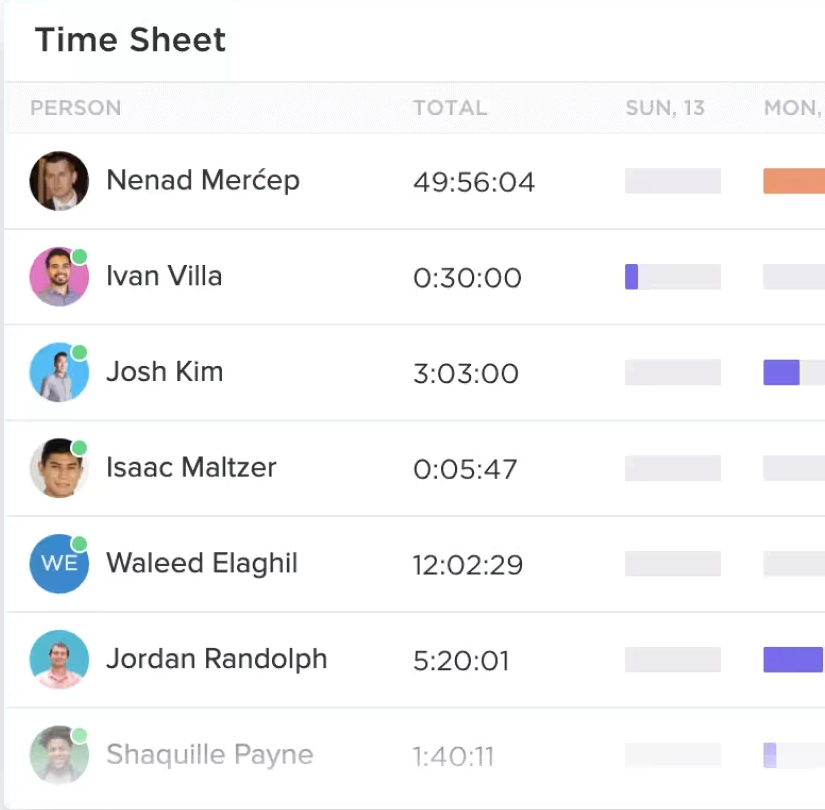
Native time tracking gives you timesheets, estimates versus actuals, and billable-hours reporting without bolting on a separate app — the kind of detail agencies and client-facing teams need when they bill by the hour.
Goals and Sprint Reports
Goals roll individual tasks up into a measurable target with automatic progress percentages, while Sprint Reports track velocity and burndown for Agile teams running two-week cycles — so a stalled sprint shows up on the dashboard before it shows up in a missed release.
ClickUp Brain: AI-Powered Reporting
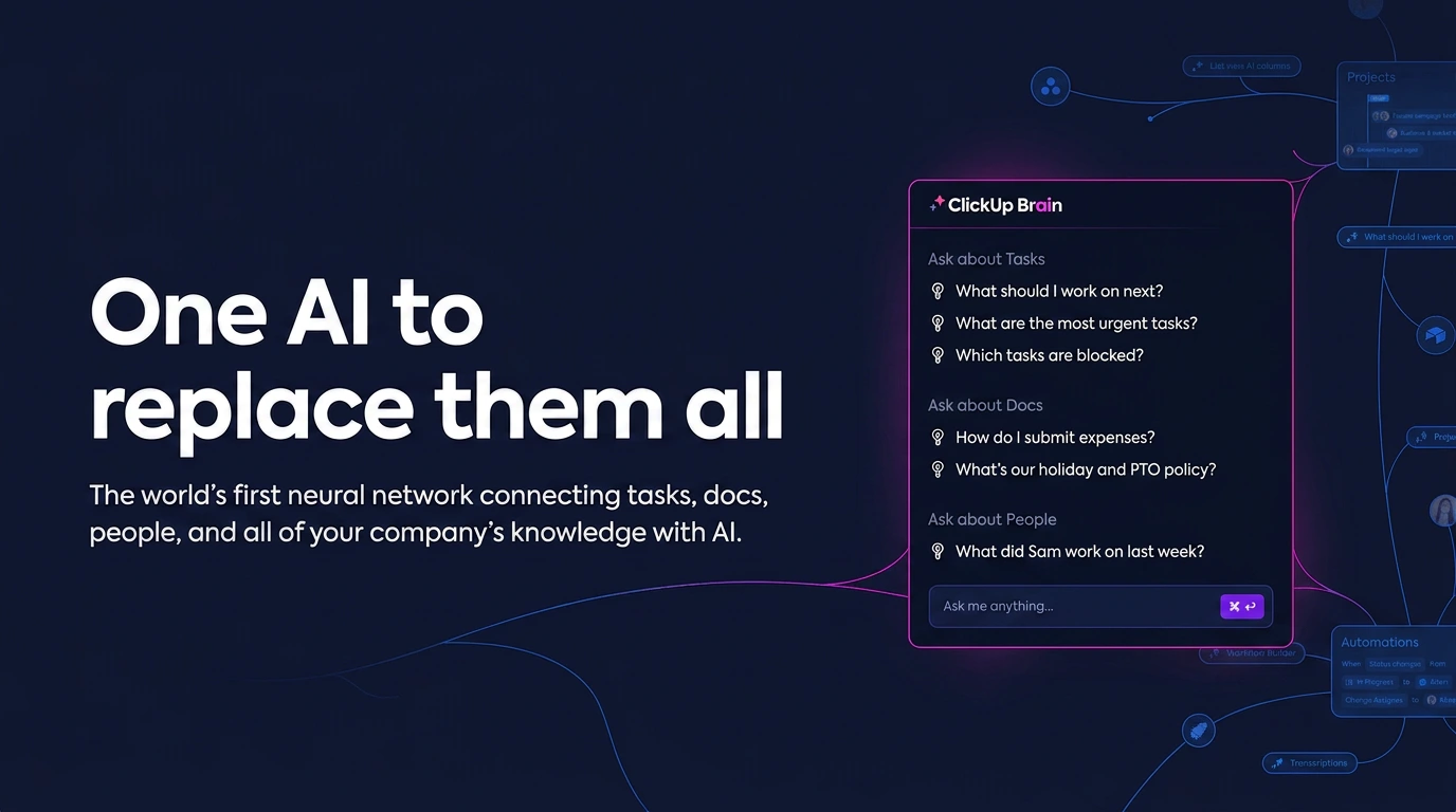
ClickUp Brain distills complex data into clear takeaways, merges data from diverse sources to reduce manual entry, and keeps reports current through scheduled updates and interactive charts that refresh in real time. This is the layer that turns a dashboard from “data” into a two-sentence summary a manager can actually read on their phone between meetings.
Workload and Capacity Views
The Workload view shows who’s overbooked and who has room before a deadline slips — arguably the most underused feature in the list, since most teams default to checking task lists instead of checking capacity.
Why Reporting and Analytics Matter for Team Performance
The case for using ClickUp reporting tools isn’t just convenience—it’s tied directly to project outcomes. PMI’s 2025 data found that only 50% of projects succeed globally, with 13% ending in outright failure. Separately, a 2026 industry survey found that even as success metrics have gotten clearer, real-time KPI access hasn’t improved and manual reporting remains largely unchanged—meaning visibility gaps, not effort, are still limiting how mature most teams’ reporting really is. On the other side of that gap, organizations with a structured reporting habit — a PMO reviewing dashboards on a schedule — complete 38% more projects on time and on budget than those without one, and automated status reporting is already the single most common AI use case, adopted by 44% of AI-using project teams.
Put together, this is the actual argument for investing in dashboards and reporting: teams that can see status in real time are the ones closing the visibility gap that the data says most organizations are still stuck in.
How Dtech Systems Helps Teams Get More From ClickUp Reporting Tools
Turning on a dashboard is easy. Building one that reflects how your business actually runs — with the right widgets, permissions, and automations feeding it — is where most teams stall out. Dtech Systems is a ClickUp Diamond Partner that helps teams design, automate, and optimize ClickUp workspaces, workflows, and reporting so they can move faster with clarity.
Where buying ClickUp direct leaves you with a subscription and a blank workspace to configure yourself, Dtech pairs each team with senior consultants who rebuild workflows live on real work rather than demos, and stays on afterward as a named team that knows the account’s context. That distinction matters specifically for reporting: a dashboard built from generic templates rarely matches how a specific team actually tracks revenue, client delivery, or sprint velocity, so it quietly stops getting opened within a month. Dtech also delivers support in English or Arabic with local billing out of Riyadh and London, which matters for teams across the GCC and wider EMEA standing up ClickUp dashboards across bilingual departments.
The Bottom Line
ClickUp reporting tools — Dashboards, time tracking, Goals, Sprint reports, and ClickUp Brain — exist to close the same visibility gap that keeps roughly half of all projects from fully succeeding. The tools themselves are free to try; what actually determines whether they get used is whether they’re built around how your team really works. That’s the part Dtech Systems specializes in, as a ClickUp Diamond Partner working with teams from ten seats to ten thousand.
FAQs
Everything you need to know about ClickUp reporting tools.
What's the fastest way to check whether your ClickUp reporting tools are actually working?
Check whether the dashboards get referenced in meetings, not just whether they exist. A quick proxy: if leadership still asks "what's the status?" in a standup after a dashboard was built for that exact purpose, the dashboard isn't doing its job — either the widgets are tracking the wrong thing, or nobody trusts the data feeding it.
Do ClickUp reporting tools require the paid plan?
Basic dashboards are available on ClickUp's free and lower-tier plans, but unlimited access to Gantt charts, advanced reporting, and sufficient storage require an upgrade to a paid plan. Most teams that outgrow the free plan do so specifically because they need reporting depth the entry-level tier doesn't include.
How much does poor reporting visibility actually cost a team?
It's measurable, not just anecdotal. Manual reporting remains the norm at most organizations even as teams say they want real-time KPI access, and teams without a structured reporting cadence complete roughly 38% fewer projects on time than organizations that review dashboards on a set schedule. That's exactly the gap dashboards, time reports, and AI-generated summaries are built to close.